 Ignacio Macri
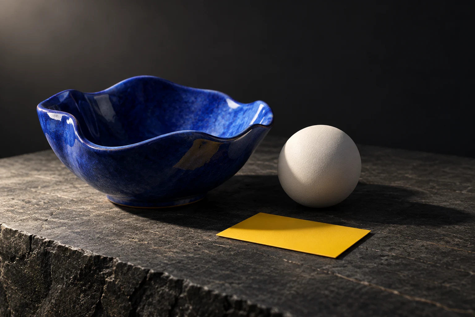
A bright object is not necessarily an easy object to read. If every surface receives similar light, the image may show its colour while hiding its form. Adding another lamp can make that problem harder to diagnose.
Try this deliberately small study: one object, one ground plane, one area light and one camera. Our aim is not to reproduce the illustration above. It is to learn which change caused the result.
Keep the scene plain
Use a simple opaque object with a curved surface and at least one recognisable edge. A bowl, cup or rounded block works. Give it a plain material and place it on a larger ground plane. Avoid a reflective chrome finish or a glass material at this stage; those introduce other questions.
Choose a camera angle that shows the object’s shape clearly. Leave room around it for the shadow. Save the scene before lighting adjustments, and keep the camera fixed for the first comparisons. If you move the camera and the light together, you will not know which change helped.
Change the direction
Add an area light and start with it above and to one side of the object. Make a small test render. Then move the light to a more frontal position and render again, keeping the other settings the same.
Compare the two images at the same size. Look for the transition between the lit side and the darker side. Which placement makes the curve easier to understand? Which makes the rim disappear? There is no universal winning angle: the useful position depends on the form and what you want the viewer to notice.
If the object is nearly black, first check that the light faces it and is not blocked. Raise the light’s power gradually if necessary. Do not assume a complex material is the cause before checking the simple setup.
Change the size
Return to your preferred direction. Now compare a smaller area light with a larger one. Keep its placement fixed. Look at the edge of the ground shadow and the transitions across the object.
An area light’s size affects shadow softness. A larger emitting surface usually produces a softer transition than a small one at a comparable position. Brightness can also change with the lighting setup, so judge the shape of the shadow separately from whether the whole picture feels lighter.
Make a note in ordinary language: “The larger source softens the shadow beside the handle.” That observation is more useful than copying a numerical value you will not understand in a different scene.
Control the comparison
Render three labelled variations: your initial setup, the direction change and the size change. Use the same render engine, output dimensions and colour-management settings. Keep the material and camera unchanged.
When too many variables move, an image can improve without teaching you anything. A controlled comparison turns the change into knowledge you can reuse. If you need to adjust brightness for a fair comparison, record that adjustment as well.
Frame the result
After the lighting study, move the camera. Compare a close crop with a wider one that includes the complete shadow. Decide whether the shadow is helping explain the object or pulling attention away from it.
Check the image at thumbnail size. The silhouette, the brightest area and the main shadow should still form a clear arrangement. Small textures are unlikely to rescue a composition that disappears when it gets smaller.
Know when to stop
Keep the version that explains the object most clearly, together with its scene file. If no light position helps, return to the silhouette study: the shape or camera angle may be the real problem. If you can see the lighting change you want but cannot control it, use that specific obstacle to choose the next lesson.
Sources
Blender Manual: light objects; official Lighting & Rendering lesson list. This is an independent exercise, not an official course assignment.